Why Every London Tube Line Has a Color (And Why You End Up Thinking in Colors Instead of Places)
If you’ve ever used the London Underground, you’ll notice something strange very quickly.
People don’t give directions like this:
“Take this train to that station.”
Instead, they say:
“Get on the Central line.”
“Change to the Northern line.”
“Stay on the Piccadilly line.”
And after a while…
You stop thinking in station names too.
You start thinking in colours.
Red.
Blue.
Brown.
Yellow.
And once that happens, something interesting shifts:
The map starts making sense in a completely different way.
But this wasn’t accidental.
London’s Tube lines have colors for a very specific reason and it completely changed how people navigate the city.
First Yes, Every Line Has a Color (And It’s Intentional)
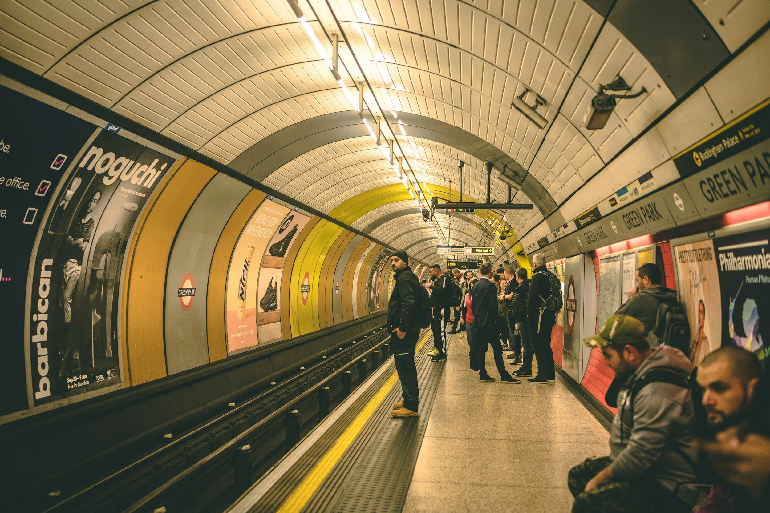
If you look at the official map of the
London Underground
Every line is assigned a distinct colour.
For example:
Central line → Red
Piccadilly line → Dark blue
District line → Green
Bakerloo line → Brown
And this is not just for design.
It’s for survival.
The Problem London Had Before Colours
Before the modern Tube map existed…
London’s Underground maps were:
Messy
Over complicated
Hard to read
They tried to represent:
Real geography
Exact distances
Complex routes
And the result?
Confusion
Because London’s network is:
Dense
Irregular
Not built in straight lines
So trying to map it realistically made it harder to use
The Turning Point: Harry Beck (1933)
Everything changed with one person:
Harry Beck
In 1933, he introduced something radical:
A completely simplified Tube map
Instead of focusing on geography, he focused on:
Clarity
What He Changed
Straightened the lines
Evenly spaced stations
Removed unnecessary detail
Used bold colours
The result:
A map that was finally easy to understand
And most importantly:
Colours became essential
Why Colors Were the Smartest Choice
Think about it.
If every line looked the same:
You’d constantly get confused
But colours allow you to:
Instantly recognise your route
Instead of reading:
You see
For example:
“Follow the red line” is faster than reading 10 station names
That’s the power of visual navigation
Why Your Brain Starts Thinking in Colors
After using the Tube for a while, something interesting happens.
You stop thinking:
“I need to go from A to B”
You start thinking:
“I need to get on the blue line and switch to yellow”
This happens because:
Your brain prefers patterns over complexity
Colours are:
Easier to remember
Faster to process
More intuitive
And London uses this perfectly
It’s Not Just Design It’s Identity
Each line is more than just a route.
It has:
A personality
For example:
Central line → Busy, fast, intense
Northern line → Confusing, split routes
Piccadilly line → Long journeys, airport connection
And the color becomes part of that identity
You don’t just remember the route.
You remember the feeling
Why This System Influenced the World
London’s map didn’t just stay in London.
It became:
A global standard
Cities around the world started using:
Simplified maps
Colour-coded lines
Because it worked.
Today, most metro systems follow this approach
What People Get Wrong
❌ “The colors are random”
They’re carefully chosen for contrast
❌ “It’s just for aesthetics”
It’s actually functional design
❌ “The map shows real distances”
It doesn’t it’s simplified
Why This Still Matters Today
Even with:
Google Maps
Live navigation
Apps
People still rely on the Tube map
Because:
It’s faster to understand visually
It doesn’t require constant checking
And once you learn it…
You don’t forget it
Final Thought
London didn’t just build a transport system.
It built a way of thinking.
A system where colours guide you
Where complexity becomes simple
Where navigation feels intuitive
So next time you’re on the Tube…
You’re not just following a route
You’re following a colour